This article will take you on a journey through the history and development of the Lego logo. We’ll explore its evolution over time, including the history of the Lego Duplo logo. From its humble beginnings in a small Danish carpenter’s workshop to its current status as a globally recognised icon.

ARTICLE BY Samantha Lymath
The Lego logo has undergone several transformations over the years, yet it has always retained its core elements, reflecting the brand’s unwavering commitment to quality, creativity, and playfulness. Join us as we explore the fascinating story behind one of the world’s most beloved logos.
The History of the Lego Logo
The Lego logo has seen many iterations throughout the brand’s life, starting all the way back in 1934 in the Danish town of Billund.
1934 – 1936
The first Lego logo was a strong logotype in full capitals, using a serif typeface with thick vertical lines. The logo is typical of the period, using a strong typeface without imagery. This logo was part of the brand for only 2 years.
1936 – 1946
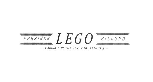
The 1936 logo maintained the logotype approach, but also featured 4 horizontal lines above the town name and location. Continuing with a serif typeface,the logo was fit for the design of the wooden packaging of their toys during the period.
1946 – 1950
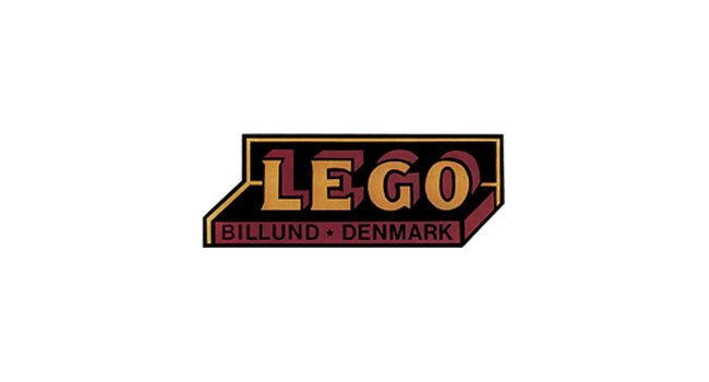
In the late 1940’s we started to uncover the origins of the Lego colour scheme. With the yellow, black and red showing in this iteration of their logo. It also features a 3d effect, paying homage to the toys they create.
The logo incorporates a serif typeface as its primary wordmark, complemented by a sans-serif typeface for the location text. This design captures the brand’s playful essence while laying the foundation for its evolving identity.
1950 – 1953
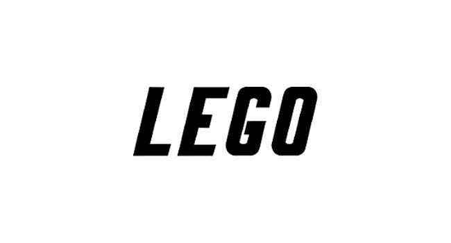
The circular design of the 1950’s logo features an elongated ‘LEGO’ in full cap on a white background. Using a sans-serif typeface for the name and using a sans-serif for the location name in the circular black border.
This logo is a movement away from the logo we know today, and was only part of the brand identity for 3 years.
1953 -1955
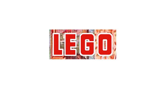
Within this period we see the brand making a key decision in their brand identity. Launching two new logos at the same time, one for their main ‘Lego’ brand and one for their ‘Automatic brick builder’. The main Lego logo reflects the 1946 logo whereas the red and white logo is almost completely new.
During this period of Lego’s history the company began to launch their ‘automatic brick builder’. A forerunner for their Lego bricks which would later be ‘Lego System’. We can see this as the company moves their brand identity towards the ‘system’.
1955 – 1956
We can see the brand has now shifted towards the logo towards using a roundel and using a palette of red, white and black. This includes a custom typeface reflecting a calligraphic style,with supportive text below. Also using a balled ends on a line behind the logo, referring to the system of the brick builders.
The 1955 logo is also where we start to see the outline black text-border for their name. This is something that features throughout all the later logos, quickly building visual resonance.
This is the beginning of a significant period of brand identity evolution for LEGO, as the company rapidly transformed its imagery. Over the next decade, the brand underwent frequent changes to its visual identity.
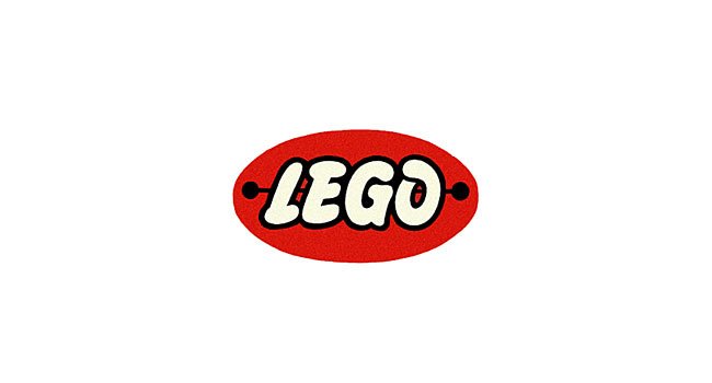
1956 – 1958
The 1956 logo features a bigger, bolder typeface and marks the first prominent use of yellow within the logo. The logo continued to remain similar throughout the 1950’s with small changes, crafting the size of the lego name to increase its standout from the red background, however, they have reduced the amount of text. Now only using the word ‘system’ in block, bold capitals.
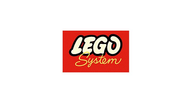
1958 – 1964
During the period from 1958 to 1964 there were two active logos. One featuring rounded edges and reflecting much more of the 1955 logo. Whereas the alternative uses a square border and doesn’t feature the balled line background element.
Both these logos incorporate the word system, one in a block bold sans-serif, the other in a handwritten typeface.
1964 – 1973
From 1964 we see the logo start taking its final form. No longer featuring rounded edges or block bold capital text. The Lego brand now uses a square box design, with their custom typeface that we’ve seen since the early 1950’s.
The word system uses a similar handwritten typeface to the 1958 logo in their now commonly used yellow.
1973 – 1998
In 1973 the logo took its almost final form. Remaining with their now square design, custom typeface and yellow, black and red design. This new logo features a black border for the square. It also features a text-border of yellow and then black.
The logo is modern and playful and has become a symbol of youth and fun ever since.

1998 – Present Day
The 1998 logo is a slight redraw of the 1973 logo. Using a darker rich shade of red and yellow, and also enhancing the black as well.

Defining the Lego Logo
The LEGO logo embodies several key messages and values associated with the brand:
- Creativity and Imagination: LEGO encourages creativity and imagination through its building blocks, allowing individuals to construct anything they can imagine. The logo reflects this spirit of creativity by showcasing the playful and versatile nature of LEGO bricks.
- Fun and Playfulness: The vibrant colours and bold font of the LEGO logo convey a sense of fun and lighthearted, highlighting the joy and enjoyment associated with building with LEGO sets.
- Universality and Inclusivity: LEGO is a globally recognised brand that transcends cultural and language barriers. The simplicity and universality of the LEGO logo reflect its appeal to people of all ages, backgrounds, and cultures.
Overall, the LEGO logo communicates a message of creativity, fun, versatility, and inclusivity, embodying the core values of the LEGO brand.
View our previous article on hiring a branding agency in London.
The Lego Duplo Logo: A Sub-Brand’s Identity
The Lego Duplo line, aimed at younger children, has its own distinct logo history. The Duplo logo often includes a depiction of a Duplo figure, differentiating it from the standard Lego range.
The Duplo logo’s design principles mirror those of the main Lego logo, maintaining brand consistency. Its design reflects the brand’s commitment to quality and creativity. As well as tailoring to the appeal to its target audience of younger children.
Consistency and Resonance: The Power of the Lego Logo
The Lego logo’s consistency in core elements has played a crucial role in maintaining brand recognition. Despite several redesigns, the spirit of the brand remains unchanged. Always reflecting the company’s commitment to quality, community, and creativity.
Trademarks
Trademarks protect the logo’s design elements ensuring the preservation of its unique identity. This consistency has contributed to the Lego logo’s global success and cross-generational appeal. All this comes together to make it one of the most recognized logos in the world.
We mention Lego’s emotional connection to their audience in our previous article. The Impact of Branding on Consumer Buying Behavior.
The Cultural Impact of the Lego Logo
The Lego logo is not just a brand identifier. It’s a symbol of the cultural impact the company has had on generations of builders. The logo’s simplicity and recognisability allows Lego to be a cultural icon beyond the toy industry. Influencing branding in the toy industry and beyond.
The Lego logo’s history showcases the balance between tradition and modernity in brand management. The journey from small Danish company to a global icon is a testament to the brand’s ability to adapt. Overcoming a changing market and consumer preferences, making it a beloved part of childhood and creativity worldwide.
Conclusion: The Lego Logo in the Modern Era
The Lego logo’s history is a narrative of a brand becoming a beloved part of childhood and creativity worldwide. Its evolution reflects the company’s growth, innovation, and commitment to quality. All coming together to make a prime example of successful brand consistency and longevity in design.
Expertise That Elevates Your Brand to New Heights
Build your brand with Fellow’s comprehensive services. From innovative brand strategy to captivating design, explore our services page to see how we can transform your brand’s vision into reality.